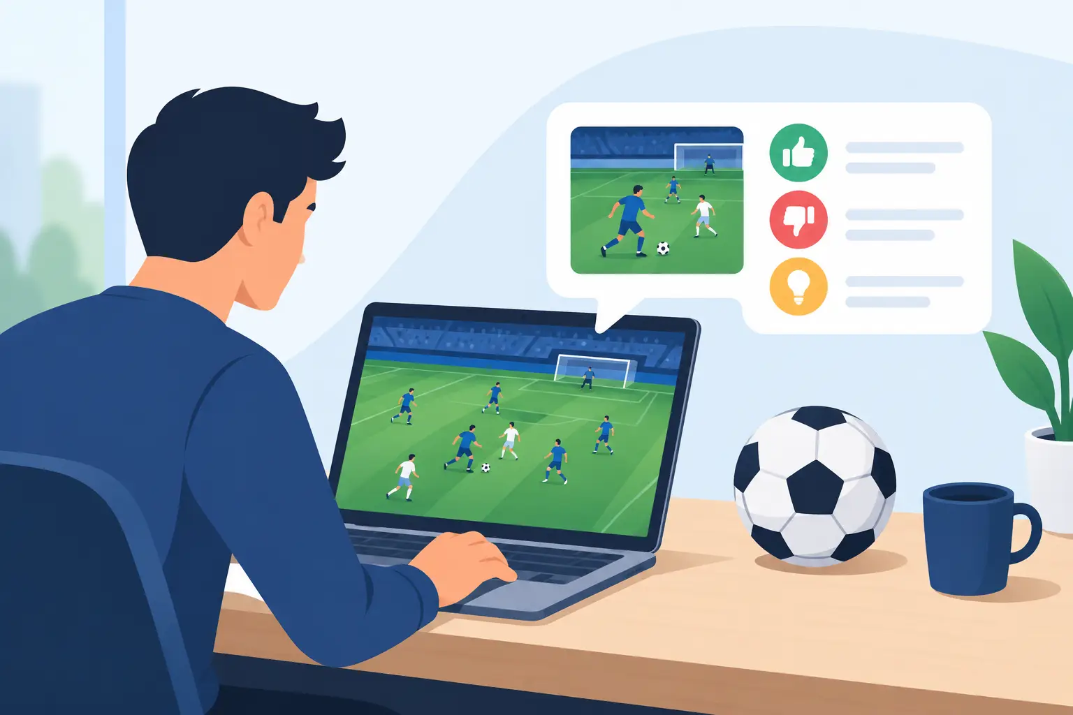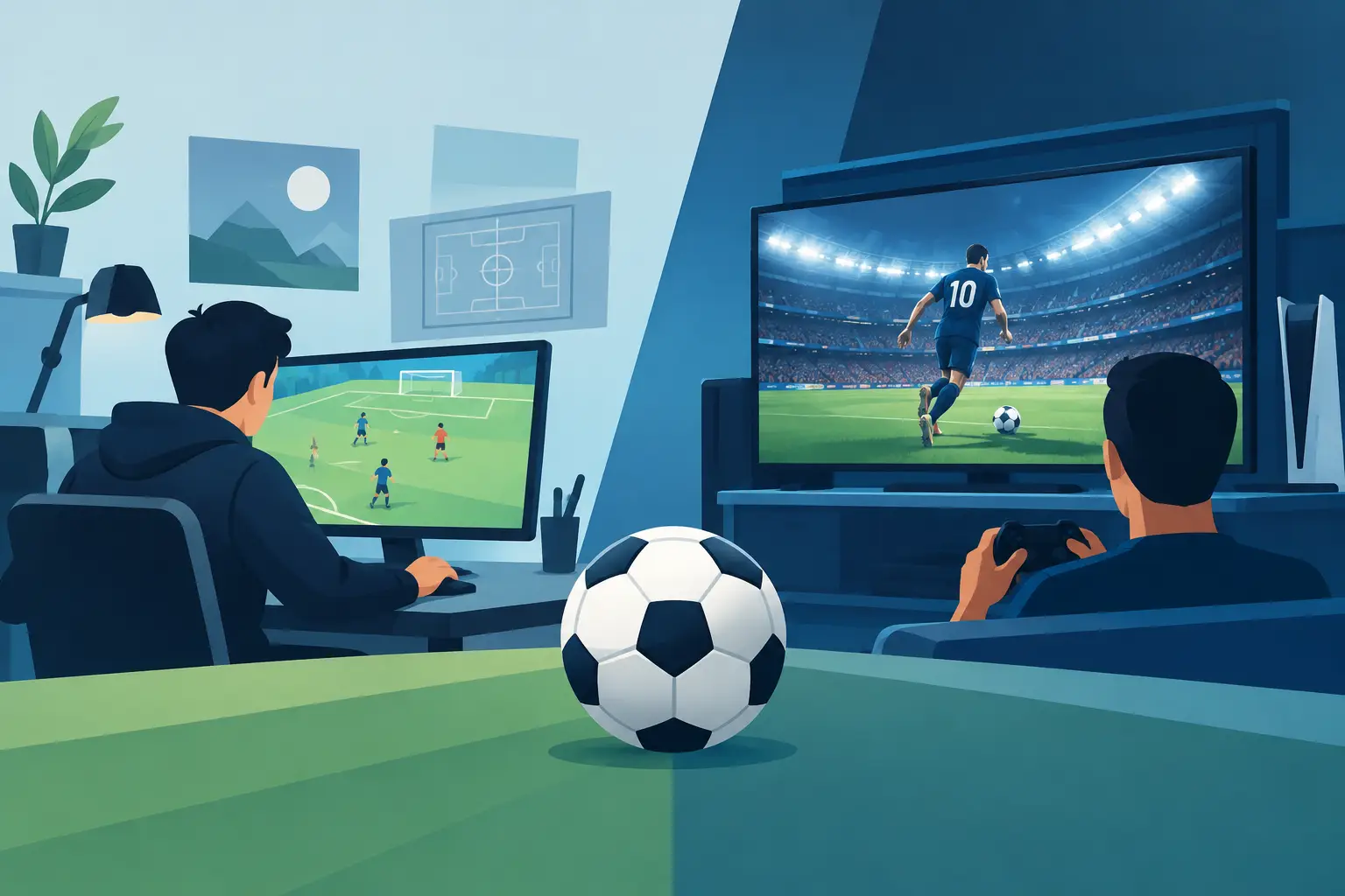
The first thing players judge is not your controls. It is the feeling. Before a pass is made or a shot is taken, the art tells them what kind of football world they have entered. That is why a strong game art direction review matters so much. It shows whether the project looks exciting, feels consistent, and gives people a reason to believe in what is being built.
For a football game, this is bigger than picking nice colors or making menus look polished. Art direction sets the emotional pace. It decides whether the experience feels fast, modern, global, grounded, arcade-driven, cinematic, or confused. If the visual identity is sharp, fans feel momentum. If it is mixed or generic, trust drops fast.
What a game art direction review should actually judge
A lot of people hear the phrase and think it means critiquing graphics quality. That is only part of it. A real game art direction review asks a harder question: does every visual choice support the same vision?
That includes player models, stadium atmosphere, lighting, camera presentation, menus, typography, motion graphics, social assets, and even the way a goal celebration is framed. A project can have technically decent assets and still feel directionless if those pieces do not belong to the same world.
For football games, consistency matters because fans instantly recognize what feels authentic and what feels off. A hyper-real player tunnel next to a cartoon-style scoreboard can work, but only if the project clearly commits to that contrast. If it happens by accident, players read it as unfinished.
A useful review also looks at whether the visual style matches the intended audience. A game built for serious simulation fans needs a different treatment than one aimed at broad, global entertainment. Neither choice is wrong. The mistake is trying to promise both at once without a visual system that supports it.
Why football games live or die on visual identity
Football is emotional before it is mechanical. Rivalries, crowd energy, club colors, player swagger, stadium scale, and match-day pressure are all visual experiences. The art direction has to carry that weight.
When players load up a football game, they want to feel the sport immediately. That does not always mean pure realism. Sometimes stylized direction creates a stronger identity than chasing photoreal detail that an independent project cannot sustain. In fact, that trade-off is often where smart teams separate themselves. A bold, consistent style is usually more memorable than an uneven attempt to imitate the biggest publishers.
This is especially true for newer projects trying to earn support. People back momentum. They respond to signs that a team knows what it is building and how it wants that world to feel. Clear art direction makes a project feel real, even before every feature is finished.
The key areas to review in football game art direction
Match presentation
The pitch is the stage, but the presentation creates drama. A review should look at camera angles, lighting, weather treatment, scoreboard design, crowd density, and how motion is framed during key moments. Does the match feel alive, or does it feel flat?
Pace matters here. Football is full of tension between quiet buildup and explosive release. Good art direction supports that rhythm. Bright overlays, crowd reactions, replay framing, and transitions should amplify the action without turning every moment into noise.
Player identity
Fans connect with people, not just systems. Even if a project is early, player silhouettes, kit design, animation style, and facial treatment all shape how memorable the experience becomes. A game art direction review should ask whether players look distinct enough to support attachment.
There is an important balance here. Detailed realism can impress, but only if animation and lighting keep up. If not, a cleaner, more stylized character direction may feel stronger and more confident. It depends on the project scope and the promise being made.
Interface and readability
This is where many games lose clarity. Menus, icons, type choices, formation screens, player cards, and stat displays are part of art direction too. If they feel disconnected from the on-pitch experience, the whole project starts to split into separate moods.
Football games need readable information at speed. A flashy interface that slows decision-making hurts the experience. On the other hand, a clean but generic interface can make the game feel forgettable. The best direction finds a visual language that is exciting and easy to understand.
Brand world and atmosphere
A football game should feel like more than isolated matches. The wider world matters. Promotional visuals, loading screens, key art, mode branding, and environmental details all contribute to whether the game feels like a growing universe or just a collection of assets.
This matters even more for community-backed projects. People are not only responding to a feature set. They are responding to a vision. If the art direction creates a believable football world with energy and identity, supporters can imagine where the project is going.
What weak art direction usually looks like
Most weak art direction is not ugly. It is inconsistent.
You see it when one screen looks ultra-modern and the next looks like a mobile template. You see it when the stadiums aim for realism but the player proportions feel exaggerated without purpose. You see it when social graphics promise a premium football experience while in-game visuals suggest a completely different tone.
That gap is costly. It creates doubt. Players and supporters may not explain it in art-school language, but they feel it right away. Something looks off, and once that feeling lands, excitement becomes harder to sustain.
Another common issue is overreaching. Teams sometimes chase visual standards that are too expensive to maintain across the full game. A polished hero shot is useful, but if the rest of the experience cannot match it, the direction starts to break. Strong review means being honest about scope.
A better way to think about game art direction review
The goal is not to ask, is this as advanced as the biggest sports titles? That question is too narrow and usually unfair. A better question is this: does the visual direction make players want to believe in this game?
That shifts the review toward identity, consistency, and emotional pull. It gives independent projects room to make smart choices instead of chasing someone else’s budget.
For example, a football project might choose a high-energy broadcast look with stylized lighting, bold UI shapes, and dramatic crowd color. Another might aim for grounded realism with restrained overlays and natural stadium presentation. Both can work. What matters is commitment and execution.
This is where an independent builder mindset becomes exciting. You do not need to copy the old formula to create something fans care about. You need a clear point of view and the discipline to carry it through every part of the experience.
How supporters and early fans read visual progress
People who support a project early are watching for signals. They want proof that the game is moving from concept to reality. Art direction is one of the clearest signals because it is visible, immediate, and emotional.
When visual updates feel aligned, confidence grows. Fans start sharing screenshots, talking about the style, and imagining the final product. That community energy matters. It gives a project traction before it has the scale of a major release.
At the same time, transparency matters too. If a project is still evolving, it is better to show focused progress than to overpromise polish. Strong art direction does not mean pretending the game is finished. It means showing a clear destination and making each step feel intentional.
That is why community-backed projects like Infinity Football have a real opportunity. When supporters can see a football world taking shape with confidence and purpose, backing the build feels exciting, direct, and meaningful. They are not just watching a game appear. They are helping shape its identity.
The standard that really matters
A great football game does not win people over with visuals alone, but weak visuals can absolutely stall momentum. The standard is not perfection. The standard is belief.
Does the art direction create energy? Does it make the game feel coherent? Does it show players and supporters that this project knows what it wants to be? If the answer is yes, the visuals are doing more than decorating the product. They are building trust, community, and anticipation.
That is what the best game art direction review should uncover. Not whether every texture is flawless, but whether the project has a visual heartbeat that fans can rally behind. When that heartbeat is strong, people do not just notice the game. They want to be part of bringing it to life.